Cover Reveal: THE MIDNIGHT WAR OF MATEO MARTINEZ by Robin Yardi
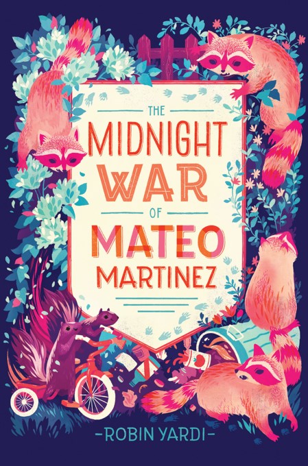
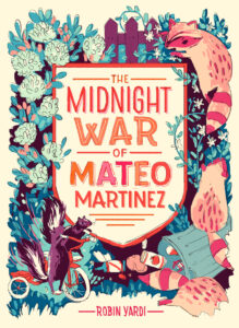
Today on TLT, we’re excited to share the cover of debut novelist Robin Yardi’s The Midnight War of Mateo Martinez, the story of a fifth grader who’s positive his old trike has been stolen by skunks. Mateo endeavors to get it back, and his quest begins in the middle of the night . . .
After the cover reveal, stick around to read a conversation between author Robin Yardi and cover designer Teagan White.
Without further ado . . .
And now for the conversation:
Robin Yardi: It’s so cool to finally talk to you! I had a pretty immediate reaction to all of your cover sketches collectively and seeing that you were the cover artist specifically. It’s something I like to call joyful nausea (I swear this is a compliment).
ADVERTISEMENT
ADVERTISEMENT
Even before I let my brain spin out into wondering which of your four sketches would be the cover I wondered . . . jeez, did she read my book? So that’s my first question. When you take on a new YA or MG cover, do you read excerpts of the book, or the whole thing?
Teagan White: Hahaha. “Joyful nausea” needs to become a commonly-used phrase! Love that reaction. 🙂
Yes, I did read your book! I don’t always read the books I do covers for. Sometimes I’m not even sent the manuscript, or sometimes the art director already has a very clear concept outlined for me. But mostly I do read them, as long as the turnaround time isn’t too fast for me to do so. Your book is fairly short, not to mention a delightful read, so I was happy to get to read it in its entirety.
RY: I had a feeling you must have, which I think also contributed to my joyful nausea. There were just too many details pulled from different places in the book, the tomato soup and the jasmine and the hydrangeas and the net and even a little letter on one of the sketches. It was quite a feeling, thinking someone besides Greg [Hunter, the book’s editor] and the team at Lerner had read the book. And it’s quite a feeling knowing you liked it!
TW: Was there ever any sort of idea or expectation in your head of what the cover might look like?
RY: After my manuscript was accepted, I actively fought against the urge to imagine the cover. I had read so many blogs and interviews about the process and heard that it really wouldn’t be up to me at all. But before I sold the book, I absolutely imagined it. One element that made it from my imaginings into your cover art, magically, without my having to suggest it, was the shield.
TW: I honestly don’t know very much about the author’s side of planning a book cover! Were you able to offer input about what type of cover artwork you wanted?
RY: As it turns out, Greg did ask for my input on the cover, both before and after the sketching stage. As far back as when he acquired the manuscript, we discussed having an illustrated cover, which is not something every book gets and something I really, really wanted! By the time we got to brainstorming concepts for the cover, we had finished most of our edits together, which made it easy to trust that whatever he and Emily Harris, the book’s designer, helped initiate in terms of illustrator choice or tone or concept would be just right for the book.
TW: I’m not sure whether it would be slightly disappointing or a big relief to not have your main character depicted on the cover. It was a plus for me, since it’s easier and more enjoyable for me to draw animals than human characters, but at the same time, Mateo and Mila are both such wonderful personalities that I wouldn’t have minded drawing them!
RY: I wasn’t disappointed not to see Mateo and Mila on the cover, but I was worried that without them there, kids would think it was a talking animal book about skunks and raccoons, instead of a talking animal book about skunks, raccoons, and kids. Greg and I talked a little bit about how to imply the human world in the cover, and I think you did that brilliantly! The tomato can, the trashcan, the fence, even the scale of your objects and animals work to accomplish this.
TW: I’m trying my best to keep this all about our topic of the cover, but I have to ask—skunks on a tricycle? Where did this idea come from?! (I instantly accepted this cover project when I read the words “skunks stealing a tricycle” in the first email, by the way, and then probably texted a few friends about it in all caps.)
RY: Ha! Well, when I first started writing this book, my daughter had a trike with a squeaky back wheel (I winged it with the car once), and we lived quite close to a wonderful neighborhood park called Kid’s World. She would ride to the park on the trike, creak-squeak, creak-squeaking the whole way. At the same time, we’re in the habit of feeding the neighborhood stray cats, which means we were also in the habit of feeding the neighborhood skunks and raccoons. Sometimes when my daughter couldn’t sleep, we would scatter dog food on the back porch and wait. We called these skunk watching nights. One night I asked my daughter, “Do you think the skunks and raccoons play at Kid’s World at night, when we are all sleeping?”
“How would they even get there?” she asked.
“Just like you,” I said. “On your squeaky trike, one on each pedal . . . ,” and so I had my beginning.
When you read a book or an excerpt, what elements are you looking to pull out for a cover?
TW: The tone, emotion, humor, and other more nebulous (but important!) qualities of the book definitely influence what I end up doing for the illustration! But since the mood that the publisher has in mind for the cover illustration is usually decided before the art director even reaches out to me, the things I’m paying the closest attention to while I read tend to be more specific. For this, I noted the personalities of the animals so that my drawings were based on actual characters, not just any skunks and any raccoons.
I also always pay attention to visual descriptions of things that I could illustrate. I keep a running list. I’m very glad that I was able to read the full book, because the way that the skunks are bursting through the hydrangea bush on the cover was an image that came to me while reading—I couldn’t stop visualizing all these characters bursting out of garden shrubs in a flurry of petals, and I wanted very much to capture that in the drawing.
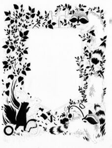
 Teagan: “I did the final art for this in black gouache. Gouache is sort of like an opaque watercolor that you can use with a brush with very little water, if you want a very flat and crisp look. . . . Painting with black gouache is essentially like painting with ink, but the consistency of the medium is thicker and more viscous, which can give you ultra-smooth lines and edges.”
RY: Once my joy nausea wore off, I was able to look at the cover concepts more objectively. Actually, that is a total lie. I immediately picked a favorite. But I wanted everyone to settle on the right cover for the book. So, I printed the concepts out and took them to the playground, showed them to kids, showed them to friends, I even considered strangers but restrained myself. It made me wonder, when you create multiple sketches, do you have a favorite?
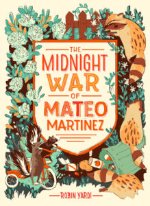
TW: Yes! I think every other illustrator I’ve ever spoken to about this has agreed: if you’re working with a client, you always have one idea that you’re really stoked on and put most of your energy into. The other sketches that you do after putting together the first idea are kind of filler, to give the client more options. Sometimes you do these grudgingly or sometimes they turn into great explorations that end up better than your original idea, but in the end, I think there is always a “right” sketch in your head, and it’s always hard if the client picks the “wrong” sketch (even if you objectively know that it was the better option for the project—which is why having an art director to make the tough choices is so valuable).
ADVERTISEMENT
ADVERTISEMENT
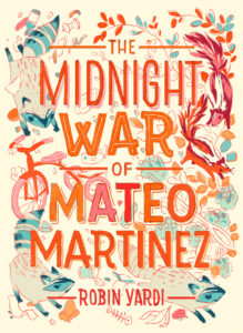
This was one of those cases where my preference changed while I worked. I really liked the idea of doing something more chaotic like the unused sketch. The concept that we went with in the end is a better composition and more suited to the book, and tells more of a narrative—definitely the better option, and I preferred it in the end.
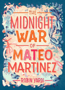
I had a strong preference on color, though, and I am so glad I got to use the pinks and blues 🙂
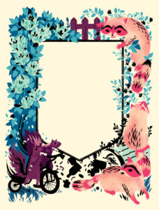
 Teagan: “I also painted in separations. If you’ve never worked in separations before, think of it as painting different parts of the image on several sheets of paper, so that when they all overlap, they form the complete picture.”
RY: Interestingly, the more chaotic sketch, with big typography, was actually the preferred version for the majority of adults I showed it to (maybe 60%), but kids were more like 90% for the shield. The swirling feeling, even the visual chaos, is pretty evocative of Mateo’s emotional state, but I think the final version gives kids who pick up the book a narrative to understand and still gives the impression of that swirly emotional chaos. Perfection!
So, Teagan, what’s your favorite element of the final cover art?
TW: Totally that tomato can.
RY: Ha—the tomato can is key!
Thanks for indulging all my curiosity. I couldn’t have asked for a more weird and wonderful cover, and it feels amazing to have your beautiful art gracing the front of the book!
Look for The Midnight War of Mateo Martinez from Carolrhoda Books, a division of Lerner Publishing Group, on March 1, 2016.
Filed under: Cover Reveal
About Karen Jensen, MLS
Karen Jensen has been a Teen Services Librarian for almost 30 years. She created TLT in 2011 and is the co-editor of The Whole Library Handbook: Teen Services with Heather Booth (ALA Editions, 2014).
ADVERTISEMENT
ADVERTISEMENT
SLJ Blog Network
The Moral Dilemma of THE MONSTER AT THE END OF THIS BOOK
Cover Reveal and Q&A: The One and Only Googoosh with Azadeh Westergaard
K is in Trouble | Review
Fighting Public School Book Bans with the Civil Rights Act
ADVERTISEMENT





Thank you, Teen Librarian Toolbox, for following us down the creative rabbit hole of sketches, cover concepts, and colors! I love Middle Grade Mondays <3 Robin
How cool is the cover? Tres cool. I imagine the book is equally nifteroony. Thanks, TLT for “covering” this story.
Beautiful cover! And so interesting to read about the process. Congratulations!!
I enjoyed reading the interview. Very nice cover! (Cool!) I am looking forward to being able to read the book!
I can’t wait to read the book! I live in an area where I have many animals in my yard at night! I leave the back slider open for the cat. Last Monday I came home to a mess on the floor. The raccoons had eaten the cat food, spilled her water, and left foot prints to tell me they left happy! I love animals! Can’t wait to get this book!