Middle School Monday – Color Coding and the Tweenage Brain
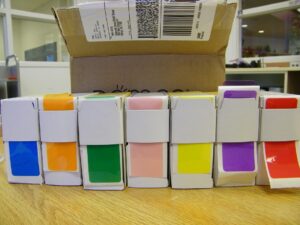 One of my favorite things about my current job is an after school club I run called “Readers Club.” The name confuses some of the parents, but the students seem to understand. It’s a club for students who love reading, but we don’t read books together. Basically, it’s a student advisory board/booster club for the library. The students give me input on decisions made for the library, they help decorate and make displays, write thank you notes to volunteers, etc. This is also the group I take with me to the elementary school for Read Across America day, so we spend a few minutes practicing our Dr. Seuss read-aloud skills every meeting.
A number of the elementary schools and some of the middle schools in the area have switched from one general fiction shelving area to ‘genrefied’ shelving. I’m not sure how I feel about it, both in terms of shelving time and student discovery, but I do know I want to take one small step in that direction. Some indication of genre on the spine of our novels would most likely increase student discovery of new books. Looking into it, there seemed to be two main options, the graphic genre labels that most library supply companies sell, and color coded spine label covers. I knew which I preferred, but I thought I would get some input from my Readers Club students. The students overwhelmingly preferred the colored label covers, so that’s what we decided to go with. From there, we brainstormed fiction genres, which led to a really fascinating (to me) discussion of subject headings and the necessity to group some genres into sub genres of larger ones. They helped me come up with what they thought were the most popular genres, and then I ordered the labels.
ADVERTISEMENT
ADVERTISEMENT
Up until that point I wasn’t sure what colors would be available. Because we didn’t want brown, we ended up with what you see in the picture above (plus light blue, but it’s backordered.) Once they came it was time to meet with Readers Club again and decide which color would go with which genre. There were three that everyone immediately suggested and agreed with – none of which were a surprise to me. They all wanted horror to be red, sports to be orange, and humor to be yellow. Is there some sort of universal color association at play here? It would make an interesting study – maybe someone has already done it. The rest of the colors were a little more difficult to assign, which led to much discussion, most of which had to do with avoiding assigning colors that are traditionally viewed as ‘gendered’ to any genre that might be at risk of being also thought of as gendered in some way. Maybe they do listen to me?
So, for this year, one of our projects as a club will be to help decide which books fall into which genres. We’ll mostly use the subject headings, but there are always a number that have multiple genre subject headings. Also, I’ll be relying upon their opinions as to which books may or may not fall within a genre – for instance, many ghost stories are horror, but some are historical fiction and some are fantasy. And where will we put magical realism, or will we just leave it with the unmarked books? I’m glad I have the students’ input, though. Much as I try, it can be difficult to know exactly what they will think.
Filed under: Uncategorized
About Robin Willis
After working in middle school libraries for over 20 years, Robin Willis now works in a public library system in Maryland.
ADVERTISEMENT
ADVERTISEMENT
SLJ Blog Network
2024 Books from Pura Belpré Winners
Passover Postings! Chris Baron, Joshua S. Levy, and Naomi Milliner Discuss On All Other Nights
Winnie-The-Pooh | Review
Parsing Religion in Public Schools
ADVERTISEMENT


I love colour-coding labels! We used them to indicate shelving locations in my former library, and they made life so much easier. Plus, you can always cut them in half to double-genre-fy some books that would benefit from multiple indicators (historical sports mysteries with ghosts!).
My thoughts on the immediate colours:
Red = blood = horror
Orange = basketball = sports (you’re in NC, right? There is no other sport.)
Yellow = smiley face = humour (It also does well in “fun” and “joy” in this, one of my favourite infographics: http://www.informationisbeautiful.net/visualizations/colours-in-cultures/ )
I’m sure that’s why they picked red for horror. 8-]
I genrefied my library last year. My kids love it. As do I. I’m K-6 so my “horror” genre is called “scary” but it is red also! And humor is yellow. Sports, however are blue. Of course, I didn’t get student input before I decided. Thinking back, I should have thought through the whole “gender the genres that might be gendered” thing first. Live and learn
jill
Yes, my horror choices are little broad, since many of them are more ‘scary ghost stories’ than they are strictly ‘horror.’ Although it’s been interesting to look at some of the subject headings available and try to analyze why which specific ones were chosen. My favorite is when a whole series is categorized as ‘horror’ except for one in the middle….
I’m trying to help my students move away from gendering items, etc. We have a lot of diversity in our population and I want the students to feel free to be themselves. Gendering things doesn’t help. I’m sure they’re tired of me talking about it.
Color-coding can be tricky for many students. Keep in mind, 8-10% of the male population has some form of color vision deficiency, meaning they cannot differentiate between some colors. That means that a considerable number of students will be confused by the colored labels and not be able to get the information the color is giving. Additionally, there are many vision impairments that might make it difficult to see the call numbers through the colored labels since the contrast is diminished in some cases. Universal Design for Learning addresses this by suggesting that you provide multiple ways for students to get the information, not just by the color. A simple way to do this is to add a symbol or a shape to each one and include that symbol on the key that tells which color/symbol means which genre. For those of us with normal color vision, color-coding is a great way to organize. However, we must remember that not everyone sees what we see.
Thanks for bringing up universal design. I’ve been thinking about how to genreify my library without rearranging everything. I had been leaning towards a graphic sticker anyway, but this is a good point about color-coding generally.
I’d like to know about your Readers Club. I do have a Book Club. It started off as the classic book club: one book plus regular discussions. As new members have come, it has been hard to make them read one book at a time; different minds, different likes and not much commitment. Perhaps I could get inspired by your Readers Club. Do you have a blog or Twitter account I could follow for ideas?
i love the idea of a reading club. I have a book club, but we don’t read the same book together. We read genres and give book talks when we get back together. It’s pretty fun.
I’m doing the same thing you’re doing with your fiction. My intention is to move them into genre sections when I’m done, but I’m going to see how they do interfiled first. I also felt the same about the colors. For instance, I used yellow for Romance instead of pink. I did use blue for Sports, but I don’t think blue will scare away girls. It’s usually the boys who don’t want to pick up anything “girly.”
Very good stuff here. Thanks for the comment and a lot of helpful stuff